Getting ahead of breast cancer in Manchester for Greater Manchester Cancer Alliance
Breast cancer is the most common form of the disease in the UK, and while survival rates are improving, tragically over 11,000 lives were lost to it last year. Breast screening programmes are helping identify early-stage breast cancer in some age groups, but women of all ages should check themselves regularly for potential signs.
Greater Manchester Cancer Alliance wanted to produce new resources to encourage people outside screening age (predominantly 40-50 and 70+), and from a diverse range of ethnic backgrounds, to do just that.
After reviewing existing research in the area, Claremont worked with local community organisations to involve 30 people in focus groups exploring the local context. Unsurprisingly, diverse attitudes were shared during the groups, pointing to the need for a campaign that could cut across a range of audiences while still feeling personally relevant.
Messaging needed to make checking feel relevant, routine and reassuring. As well as reiterating that early diagnosed breast cancer is usually survivable, the message ‘your GP wants to hear from you’ addressed potential fears relating to long waits for appointments or perceived gaslighting by healthcare professionals. A simple and memorable call to action urged people to check monthly for ‘changes’ rather than detailing a long list of concerning signs.
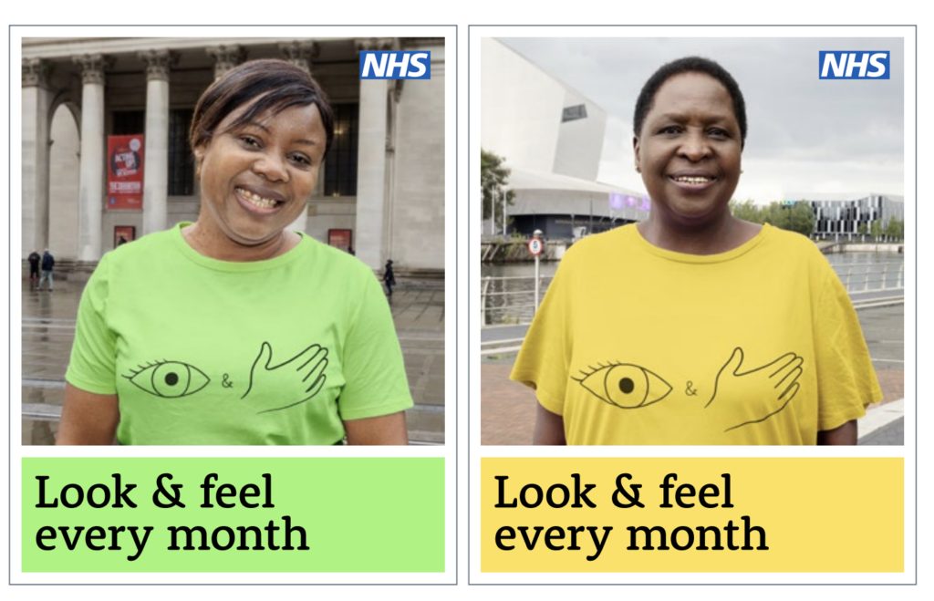
Visual routes centred around a ‘Look and Feel Every Month’ strapline were explored with local people, with a clear preference for featuring faces and landmarks from the region.
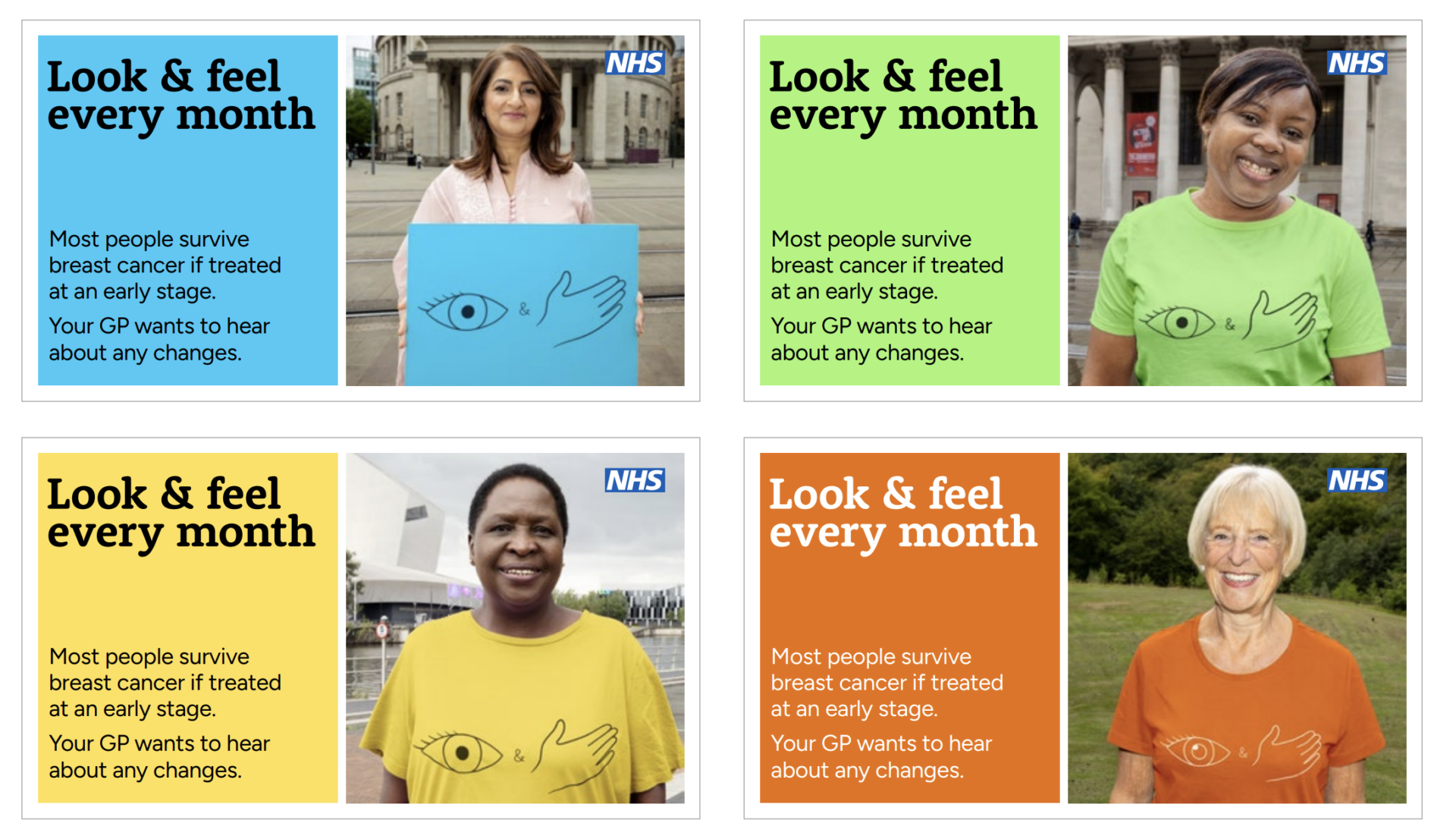
We created photography featuring local, representative people in front of recognisable landmarks. We edited the images to show the models wearing matching T-shirts with a ‘Look & Feel’ logo, adapting to use a logo board instead for some communities.
The final assets are now in use in an ‘always on’ campaign across a range of the Alliance’s channels including social media, GP information screens and local advertising spaces, as well as by community organisations. Bright colours keep things visually engaging and evoke the positive intention of the campaign. Simple and effective wording succinctly conveys the crucial key messages.