50 shades of greyscale

Francesca Davis on Feb 17, 2020
Colours influence our physiology and psychology. They affect our autonomic nervous system, memory retrieval/formation, hormonal activity and emotional stimulation.
For example, did you know that the phrase ‘seeing red’ when someone is angry is scientifically correct? EEG recordings prove that heart rate increases when we look at the colour red which can lead to impulsivity and/or anxiety. Furthermore, it’s no accident that nurses’ scrubs are often green or blue; these colours have been found to lower blood pressure and have a calming effect on patients.

We are bombarded with visual stimuli every second of our conscious lives and have therefore had to develop a system to filter out those things that we should give our attention to eg a big red stop sign, from things that we shouldn’t eg the brown table I’m sitting at. (This ‘selective filtering’ is also used for our other senses).
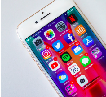
Now think back to when you last opened your phone; was there an army of apps waiting for you? A tsunami of colours bombarding you aggressively from all directions, all screaming for your attention at the same time? And next thing you know you find yourself 10 pages deep into your brothers’ best friend’s aunt Margaret’s Instagram, reliving her time in Barbados last year?
If the answer to the above questions is “yes” then you’re not alone; app designers aren’t in the dark (excuse the pun) about the power of colour and they cleverly design their apps to manipulate our attention so we click on theirs.
CHOOSING A COLOURLESS WEEK
I recently heard about the black/white filter on iPhones and was interested to see if it would influence my phone use in situations where I would usually find myself endlessly scrolling – in queues, on the Tube, while watching a film. So I took the leap and went greyscale for five days.
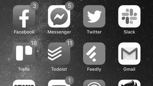
Now, apart from the fact that my once glittering home screen now looked as if it was part of a forgotten 1920’s film, after a couple of days I noticed two things:
- UNINTERESTED: when I automatically opened my phone while in a queue or on the Tube, I found myself taking one look and then locking it again rather than endlessly scrolling through Instagram into oblivion. I wasn’t engaged and I quickly lost interest.
- EFFICIENT: when I went to send a message to someone, I actually sent the message. When I went to check my calendar, I actually checked my calendar. I was more efficient with my phone use and subsequently spent less time glued to my device.
A LIFE OF BLACK AND WHITE?
For the five days I went greyscale I was less interested in my phone because, basically, it was less exciting. I wasn’t being distracted by colours appearing from all directions and, subsequently, I felt more in control of/focused on the task in hand. My choices felt less manipulated.
So, much to Instagram’s and Apple’s frustration, I think I’ll be sticking with 50 shades of grey for the foreseeable future.
Alas, I’ll probably never find out how Margaret got on with her trip to Barbados last year…